Durban’s Super Giants reveal new identity for SA20 2027
Durban’s Super Giants will roll out a new logo and red, blue and gold colours across kits, Kingsmead and fan experiences before SA20 2027.
Published
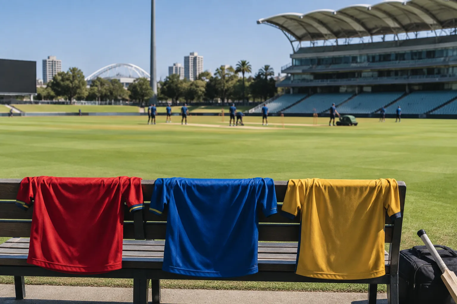
Durban’s Super Giants have unveiled a revamped identity ahead of the 2027 SA20 season, with a new logo and a red, blue and gold colour palette. The sporting franchise’s announcement centres on a coordinated change across team clothing, its Kingsmead presence and digital channels, as well as merchandise and fan experiences. For South Africa’s franchise community, it offers a branding story rather than news of a new business franchise opportunity.
A fresh identity ahead of the new season
A Lokmat Times report dated 24 September 2026, citing a press release, said Durban’s Super Giants, also known as DSG, unveiled the new look on Wednesday. The announcement described the revamped identity as part of a fresh chapter for the team ahead of the upcoming 2027 season.
The confirmed changes are a new logo and a colour palette combining red, blue and gold. Those are the central elements of the announcement; the supplied report does not provide a detailed explanation of the design choices or the process behind them.
That distinction matters when assessing the news. This is a confirmed visual identity update with a stated rollout scope. It should not be read as evidence of a change in ownership, a new commercial structure or an expansion programme, none of which is established by the supplied research.
From playing kits to Kingsmead
The new identity is set to appear across DSG’s playing and training kits, Kingsmead, digital platforms, merchandise and fan experiences before the new SA20 season. The breadth of that list makes the announcement more than a standalone logo reveal: it covers both physical and digital settings in which supporters encounter the team.
Playing and training clothing will carry the updated look, while its introduction at Kingsmead extends the change into the match venue. Merchandise and digital platforms are also explicitly included, alongside the broader category of fan experiences.
The report does not give individual launch dates for those elements. It therefore supports a pre-season rollout, but not a claim that every item or channel has already changed. Nor does it specify which parts of Kingsmead will be updated or what form the refreshed fan experiences will take.
What the announcement establishes — and what it does not
For readers following South African franchise news, the terminology needs care. DSG is an SA20 sporting franchise. This announcement is not an invitation to buy a conventional business franchise, and the research provides no information about franchise fees, outlet openings or opportunities for prospective operators.
The same caution applies to commercial results. A refreshed identity can be assessed as a branding decision, but this report does not establish any effect on merchandise sales, supporter numbers or revenue. There are no figures in the supplied material with which to measure the financial significance of the change.
The news is consequently best understood on its stated terms: a team has announced a new visual identity and identified where it intends to introduce it. Any judgement about the response from supporters or the commercial outcome would require further reporting after implementation.
A branding lesson for the franchise community
The useful point for the wider franchise community is the scope of the planned change. DSG’s announcement names several places where the identity will appear, rather than presenting the logo in isolation. That provides a practical way to think about a brand refresh: consider the different settings in which people see and experience the brand.
For a business considering its own update, the relevant questions are operational. Which customer-facing materials need changing? What must be ready before launch? How will physical premises and digital channels present the same identity? These are planning considerations, not reported details of DSG’s internal process.
Practical takeaway: Treat a visual refresh as a coordinated rollout, not simply a new logo. DSG’s announced scope provides a useful checklist of brand contact points, while its eventual results remain to be established.